Tay’s Treats & Sweets
Home Baked Goods • 2026
Keeping it Brief
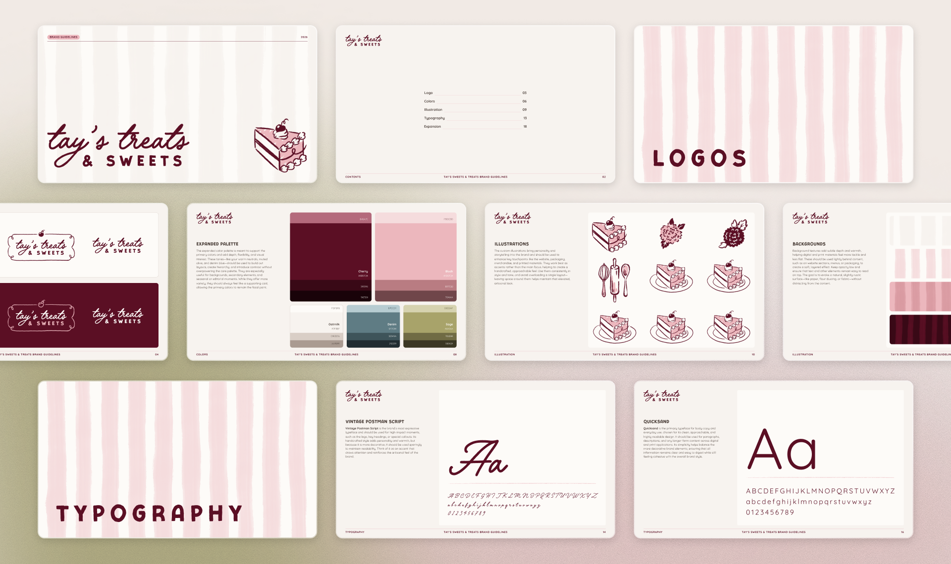
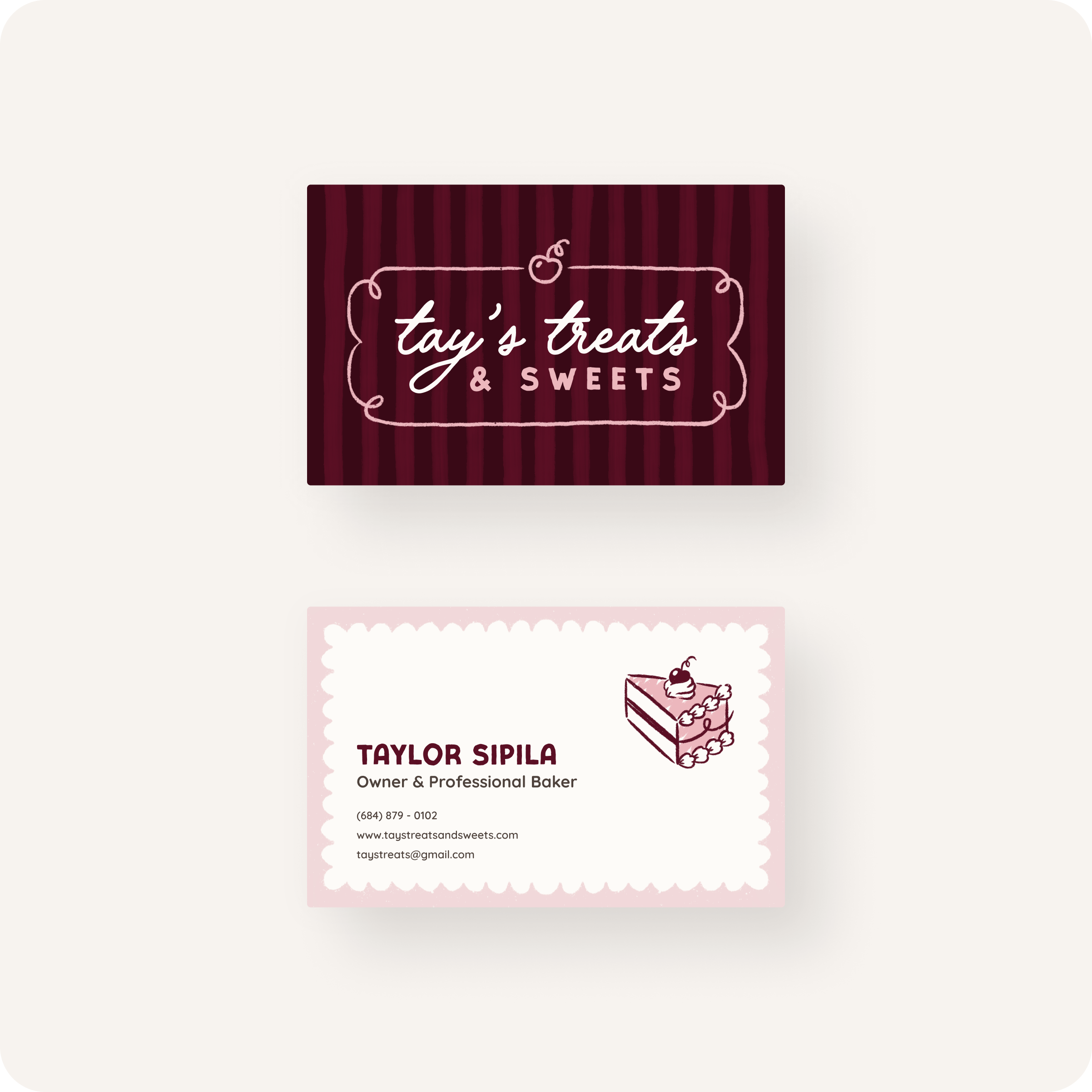
Tay's Treats and Sweets is a one-woman artisan bakery specializing in handmade confections for events and celebrations. The brand brief was personal from the start: tell the story of a maker whose craft is rooted in rural upbringing, family memory, and genuine love for what she creates.
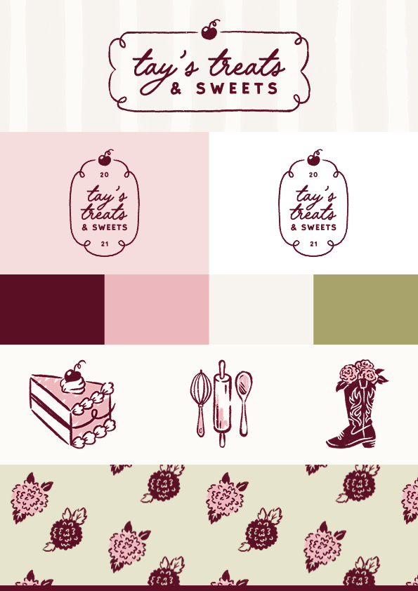
The visual identity balances elegance with handmade warmth. Typography was chosen to hold that tension — refined enough for weddings and celebrations, rustic enough to feel like it came from someone's kitchen. A suite of custom illustrations does the emotional heavy lifting across two registers. Intimate personal artifacts like a cowboy boot and dahlias from her grandfather's farm sit alongside a full set of brand-ready icons: a whisk, a wooden spoon, a slice of cake, scalloped feminine shapes. The personal details give the brand its soul. The practical set gives Tay something she can actually reach for when building a website, designing a sticker, or posting on social media.
The color palette builds the brand story from the pantry up: cherry reds, sugary pinks, floury off-whites, with accents of faded denim and field green. Those quieter tones weren't accidental. Taylor has ambitions beyond baking — florals, event planning — and the palette was designed with that future in mind. Each potential branch of the business has a home within the same color family, with cherry red anchoring the baking identity and the greens and blues held in reserve for whatever comes next. Same roots, room to grow.
All brand assets were packaged into a comprehensive brand guide, giving Taylor a reference she can use independently to keep her website and social presence consistent as the business grows.